February 17, 2012

(What I am trying to say)


You can't read it, I need to add a door. Love the background on this. Experimented with stencil and spray paint. I don't know how I feel about either. This was fast, I learned something. If I have time, ill come back to this and see if it can become something legit. I know everyone went over this piece in class but if you have any other suggestions. GO.

Daddynuel


This is my grandfather. He is in the kitchen. Acrylic.
These portraits are successes in my book, because I don't do portraits and these aren't....that bad....................................

Martin


Man, I have no idea. This is my brother. His eyes are messed up.
Watercolor/india ink/rubber cement

February 16, 2012

Surfing the internet for inspiration...

I feel like most of my breadth pieces are renditions of others previous works. I suppose that is the only way to learn, to do.

Here I have a blog of some artist somewhere. I like the collage technique of course, but it also looks like stipped paint, and using that as a background for a drawing with maybe india ink or sharpie. Like the one tittled "I am here"
http://benedelberg.tumblr.com/

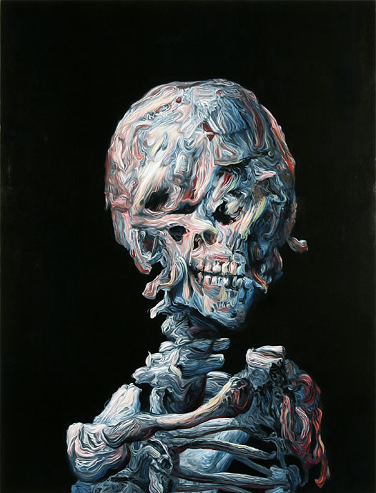
I have also come across artist Glenn Brown. I can't find his own personal web site. but his stuff is dali-like, but also some contain that drastic texture that I have been infatuated with lately. I really love this piece. Google him.


-I really want to do a piece with something repeating in it. just, I just need something like that. 3 of them. of what? I have no idea.

-I also want to do something on-edge. Something that will probably make everyone uncomfortable.

-I feel like a prisma color drawing would be appropriate somewhere in my portfolio. But I am avoiding that.

-I still have to do a mock ad with my photos and such. And I do really want to print them as well and do something with that.

-I wonder if my graduation announcements can count as a piece....OOOO.

LOOK AT THIS GUY, HIS ARBOR SERIES. I AM SO DOING THIS. I NEED SHOE POLISH OR LIKE, SOME WOOD AND SOME PAINT. I AM SO SO SO DOING THIS. THIS IS SO AWESOME. DO YOU GUYS SEE THIS JUNK? I can't breathe he has process videos. go to "watch me paint"
http://www.jacobvanloon.com/portfolio/project/arbor

February 10, 2012


Alrighty, so I am indifferent on this piece. Mainly for craftsmanship and the materials I used. I feel like If I would have used a different material, like wood or something other than the very careful foamcore this would be more precise. Also, the lines in the background are all going in one direction at the top of the triangle and yeah I dont know about sending this to AP. Might have too. Boo.

Weaving piece


Abstract weaving piece where I used acylic paint and "empastic gel" (spelling is not correct) Basically it made the paint dry with a ton of texture and a gloss finish. I also used palate knifes for this and it was fun to see that type of strokes I got with it. I used handy dandy exacto knife to cut the slits for the weaving to put through. Very different for me, but was fun and fast ! If I were to do this again I would use different colors.

I like this piece too much.


This piece has balance, my favorite color scheme. A new technique on the background, by putting gesso, washing it out and taking some sand paper to it. The cirles I created almost double as frames for my subjects, on each side of my composition. still need to work more on not relying on found images (the two people) ...but I am getting there.

December 24, 2011

Alterbook pages

These are so not in order.
David bowie. I honestly just wanted to use him in a piece. This is too busy.


Some floating raspberries and this chick.
I wanted to almost recreate the marie antuinett piece here with the horizontal line going across and one subject matter. I really cut up some different face pieces and put them together in "abstract" way. I really enjoy this colorscheme. I wish she was more to the right.
Dave grohl of foo fighters on some seaweed and a closet and some rain=what I did this semester.
YES. OK pastel colors, light....simple, sharp. I love this piece. The "Clear your mind, free your senses" is on a transparent that is glue on top of the window. I like the use of the text with the transparent a ton and I am for sure going to try and incorporate it in another piece as well.
I don't know. I don't like this. Too much going on.
Reading was the theme. Books and an asian student felt appropriate. Colors were fancy and I tried to go for multiple subjects in this. I like it!
Yeah, math was the theme for this page to I went with a x....doesn't really explain math so well, but I tried the one subject in the middle and this isn't my favorite.
I don't remember what the prompt was for this one, but I loved my use of organic lines in this...I really want to use them again.
I believe the prompt for this one was science...I tried to go with like, scifi colors...
This seems to be everyone's favorite. It is simple, direct. Calm...and contains marie Antoinette. History was the theme.

Winter break update


So earlier I posted a mini post on a cup of coffee I had in the morning.
I was going really crazy on caffeine and ended up rearranging my room and putting all my supplies and junk together in my studio (I mean room...) Then doing the photo shoot...and doing a couple of mini pieces. Here they are!


Photography

Ok so I have ventured into photography land. With the help of my friend ashley and her handy dandy camera we embarked on a rather new adventure with my other friend leslie as our model. We kept it simple and safe for our first shoot, and I focused on portraits for possible mock ads and to try out Rembrandt lighting (attempt.) I threw in my fashion-y stuff and set her in different clothes and such.

I took about 250 photos over the entire shoot.

I was able to learn a lot about lighting after looking at the photos on my computer vs just the camera. It was a real challenge to move my sucky lamps around to try and really achieve what I wanted.

So here I have linked two different albums of pictures...one is photos that I went a picked out from all my albums from basically the last year that I felt were alright...and then from my shoot today with Leslie.

Things I need to work on is editing these correctly, some that are too red, dark etc. And also in general would be subject matter. I know I played it safe like I said with these portraits but I really want to get outside the box and come up with some settings to throw some people in!

Past photos: http://imgur.com/a/fM137/all

Leslie photos!: http://imgur.com/a/2iH8U/all

let me know what you think!