
March 29, 2012
Concentration 8
Concentration 7

March 26, 2012
Concentration 6
Well

 Well I guess this is my half way point in my concentration. I am hoping that I only move forward from here. Here I moved back to my dark lines and incorporated 1 organic shape. This reminds me of a disco ball, but almost as if its floating. I may leave this piece as is but if I decide to revisit some things...this will be it. I learned in this piece to use white to my advantage and will be using that for sure in my next one! hummm
At this point I have about 4 weeks or so to get the rest of this concentration done. I feel myself moving at a pretty nice pace but id like to have some wiggle room. I am also worried that spring break is going to put me behind, I wish I wasn't going to be at the beach and working all break so I could get some stuff done... Maybe after work ill dedicate myself to maybe get 2 pieces done, or at least one. I think that is a pretty nice goal.
I find myself having trouble looking for inspiration for my lines in my pieces...I also re-reviewed Jacob Van Loons progress videos and he used a mechanical pencil for his lines...I have been using a very thick graphite pencil.
I feel like in this next piece I need a ton of royal blue and these thin lines and white and something with a summer feel. I just have no idea what. I am feeling triangles.
Well I guess this is my half way point in my concentration. I am hoping that I only move forward from here. Here I moved back to my dark lines and incorporated 1 organic shape. This reminds me of a disco ball, but almost as if its floating. I may leave this piece as is but if I decide to revisit some things...this will be it. I learned in this piece to use white to my advantage and will be using that for sure in my next one! hummm
At this point I have about 4 weeks or so to get the rest of this concentration done. I feel myself moving at a pretty nice pace but id like to have some wiggle room. I am also worried that spring break is going to put me behind, I wish I wasn't going to be at the beach and working all break so I could get some stuff done... Maybe after work ill dedicate myself to maybe get 2 pieces done, or at least one. I think that is a pretty nice goal.
I find myself having trouble looking for inspiration for my lines in my pieces...I also re-reviewed Jacob Van Loons progress videos and he used a mechanical pencil for his lines...I have been using a very thick graphite pencil.
I feel like in this next piece I need a ton of royal blue and these thin lines and white and something with a summer feel. I just have no idea what. I am feeling triangles.


Concentration 5


March 18, 2012
Concentration 4


Alright, this brought on a challenge! First this piece was inspired my a tu-tu. I have no idea why, but it is. I call those things, planks and it has turned into a astronomical design. I had a seafoam green and coral background in the beginning of this piece and I was lost on where to go for colors. I ended up almost ruining the piece all together when I covered it in guesso and basically started over.I then attempted to rub the guesso off...creating this weird streak affect with the graphite that you can still see. I decided that the background had to be dark to help the perspective of the design really stand out. So I started with that the the gray water color mixed with the not dry guesso and did that weird effect thing when I was trying to dry it and my hands got in it and I dont know it worked. Then I just went along with the warm planks I had already painted and used purple as my color of inspiration. When I finished the planks it was missing contrast so I did my usual final touch of splatter and mixing with white and ended up adding that one shape of white as if almost the design was coming out of it. And last but not least I added almost a gradient of shadow of white to all the planks that really just put the final touch on the entire thing really making sure everything harmonized. I finished it off with the spider web frame of misc. lines and well, after 2 days of back and forth I think that this piece actually made it out alive! Success ...................
Concentration 3

I wish I had a photo of my original design for this piece to show the development of how these designs go when first being formulated in my mind. The colors in this piece, the tranquility and energy I think I created ...its there. This piece is on thicker wood that posed question to weight of my portfolio and if using wood is safe and won't break/split when being sent to AP for quality pieces, but it has no deemed it self a problem. I also didnt have that much design in this, compared to concentration 1 this has no lines in it at all and I found myself struggling to find different blues and browns for each portion. I need to add more detail in my design for future pieces.
Also in this piece, for lack of detail I decided to have the main subject of the design almost sit in this spider web, a frame almost of misc. lines. I feel like they hold everything together, but I do not want to rely on them for all my designs.
Concentration 2


So I tried to test out colors and design in this pieces vs. concentration 1. I went with a cold color scheme, and use the organic circles as my design vs the straight lines and such in the other. I did this on bristol board, and itll be the only one that is not on some sort of wood, and really it taught me the effect that the wood gives is crutial to the type of look I am really looking for. the wood just does something to the colors, even with the guesso down it really harmonizes everything. I love working on wood. its not heavy , no bending , just stable. It helps so much in using watercolor, something that usually warps!
I also had no intentions of adding the "cross hairs" but the cool composition needed some direction so I broke it up with a warm line, in orange. I feel like anyone can do this piece, it did its job in showing me the opposite of concentration 1 but I didnt get anything out of it.
Concentration 1


previous post with progress photos seen here:
http://rhhsartsarahr.blogspot.com/2012/03/beginning-of-water-color-wood.html?showComment=1332044669436#c9218292660322219802
This piece was about the process. Birch wood, water color, and graphite. I had to figure out if I liked guesso down first on the wood or if I could use fixative for the graphite or not. The design , I have no idea where is came from but it helped me out with my color scheme. I like this.
March 12, 2012
March 11, 2012
I missed the blog eval
But all is well I am doing it in class, but on another note I wanted to comment on things I am really interested in right now.
As I know I just i finished the birch wood water color piece and well, it may be one of my best pieces yet. I tried to recreate the same feel with cooler colors that I will upload later, but with an organic design of circles vs. polygons.
I don;t know why but lines, they are really speaking to me right now. Just simplistic lines. Not so much to create a subject matter but just in design. I enjoyed creating a focal point in the birch piece of the one circle amongst all the lines.
I wonder where my mind is gonig with this, I feel so inspired by them right now but I dont know any other way of interpreting it through my art work other than with the water color and birch wood technique that I have already done. In collage lines seem redundant because they are so simple. And plus I would only be able to use that element of design in a backgound of one of my concentration pieces since it is now portraits.
Thoughts...
March 6, 2012


I will revisit this.
I want to revisit this and make layer it up and really get the smoke down, and the colors in the background and window and such. I was working of that photograph that I had seen previously but I guess I dreamt that window up or something. I have no idea.


I am secretly really freaked out by the fact that I put the handle of the mug on the left and in the picture it is on the right. I have no idea why but I am freaked out right now. Also...this needs a lot of work. ok.


I am secretly really freaked out by the fact that I put the handle of the mug on the left and in the picture it is on the right. I have no idea why but I am freaked out right now. Also...this needs a lot of work. ok.
A little risk
Alright so I really enjoyed experimenting with implied texture in this piece (I learned the difference between physical and implied texture, I know its pretty obvious but I enjoy this knowledge)
And well I was going to go for an abstract like, collage piece using my my own papers and such and it ended up turning into triangles and then I had like some orange design going on and then I was like, alright thats not working. So Brandt suggested a abstract drawing thing. So I went with white and black thing and some difficult cup thing and bam. So far I have only heard positive on this piece but honestly I don't feel it.


And well I was going to go for an abstract like, collage piece using my my own papers and such and it ended up turning into triangles and then I had like some orange design going on and then I was like, alright thats not working. So Brandt suggested a abstract drawing thing. So I went with white and black thing and some difficult cup thing and bam. So far I have only heard positive on this piece but honestly I don't feel it.


Tell me what to do with this.
This (below) is the photo and the feel I worked off of for this peice.
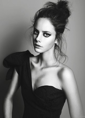
I love this design, I love this girl, I love that its in black.
But I HATE what is going on in the background.
Would someone care to tell me what to do with it cause seriously I would like to all this done.
-White one was the pre-design...I did the red...and it looks evil....and then the green makes her look...green.
I want to go for an edgy look here you guys.


Concentration alteration.
PREVIOUS CONCENTRATION:
VOGUE with a concentration in Collage. (With a bit of expeirmenting in there as well)
I will be incorporating physical pieces of fashion (cloth and buttons), the form of fashion in the sense of the human body, as well as the expression and emotion that one expresses through their clothing and demeanor.
NEW CONCENTRATION:
Basically I am just going to do my collage thing and throw some people in there and call it portraits.
Tomorrow
Alright, so I haven o officially started my concentration! Head on...
"Collage portraits"
This piece here has the basics of what I want to see in each piece.
-Subject (person)
-Collage
-Text
-Balance
-Color Scheme
*Paying close attention to detail shown in each subject.
I did something really cool with this one and decided to snap a pic between each major part of the collage so when seen like this... we have a time relapse! I did this piece in one week! Very proud of myself for that, and even got a mini breadth piece out in the middle of it. I feel like I am on the right track!


Subscribe to:
Posts (Atom)